As a UX designer,
1) I iteratively designed the user flow of the feature and wireframe
2) I designed the UI based on the existing design system created by other Visual Designer.
3) I prototyped interactive prototype, planned user study with UX Researcher.
4) I constantly communicated with team of Engineers, Product Manager, two vendors, and Marketing team.
Sketch, Workflow, Wireframe, High-fidelity UI design, Interactive prototype, Usability Test, A/B Test
Figma, Adobe XD, Protopie, Zeplin, After Effects
*I cannot share some of project details in public.
Some of images are blurred on purpose and any images presented here are not part of the actual release.
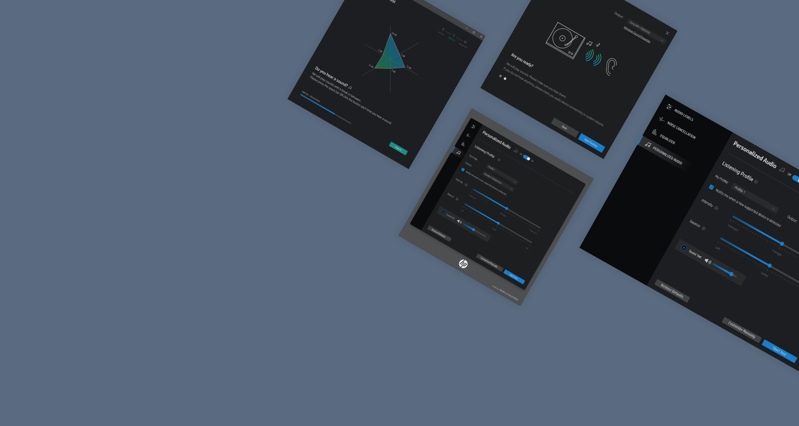
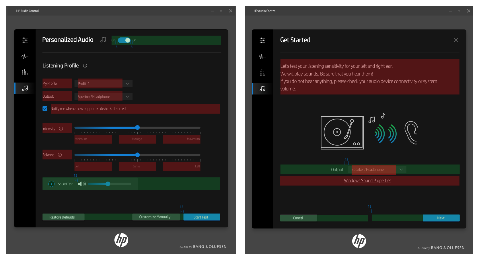
The project name is called Earcal (Actual product will be launched in different name), and it is a new PC software feature that will be part of HP audio setting. Earcal tunes the audio device and content to listening sensitivity to compensate any hearing loss on the specific frequency or ear. The technology from third-party vendor includes the automated test, hearing compensation, and advanced settings. I was asked to design a listening test feature in which user calibrates the sound to their listening sensitivity.
I worked with two different vendors - one who develops the feature and the other who works on the front-end.
Internally, I worked with Product Manager, Audio-engineering team, Marketing, Visual Designer and UX Researcher
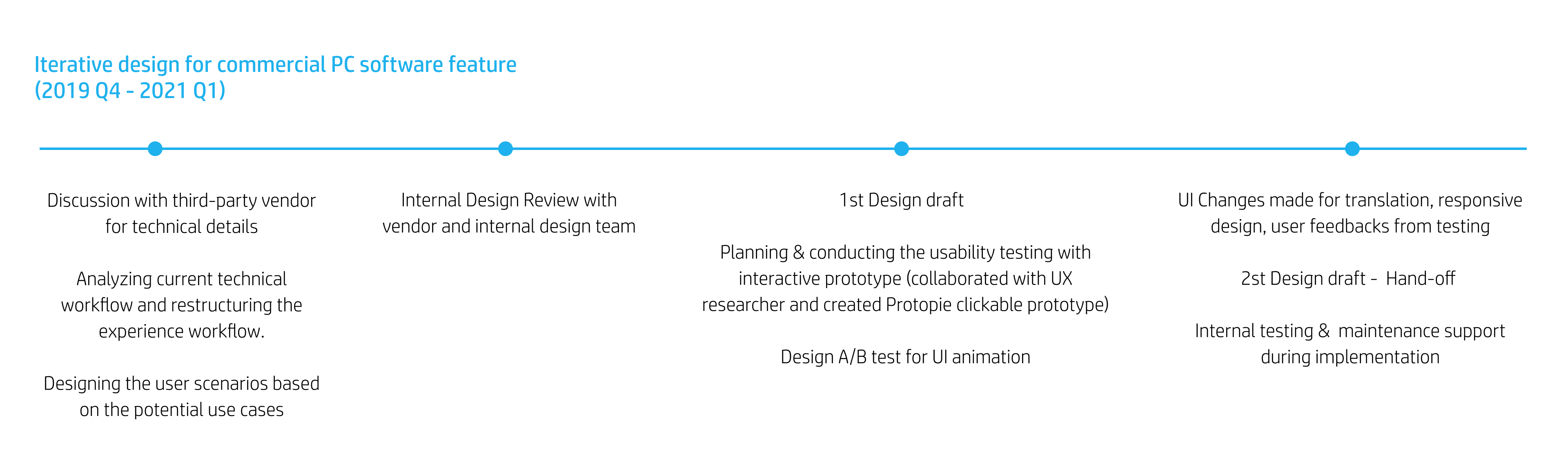
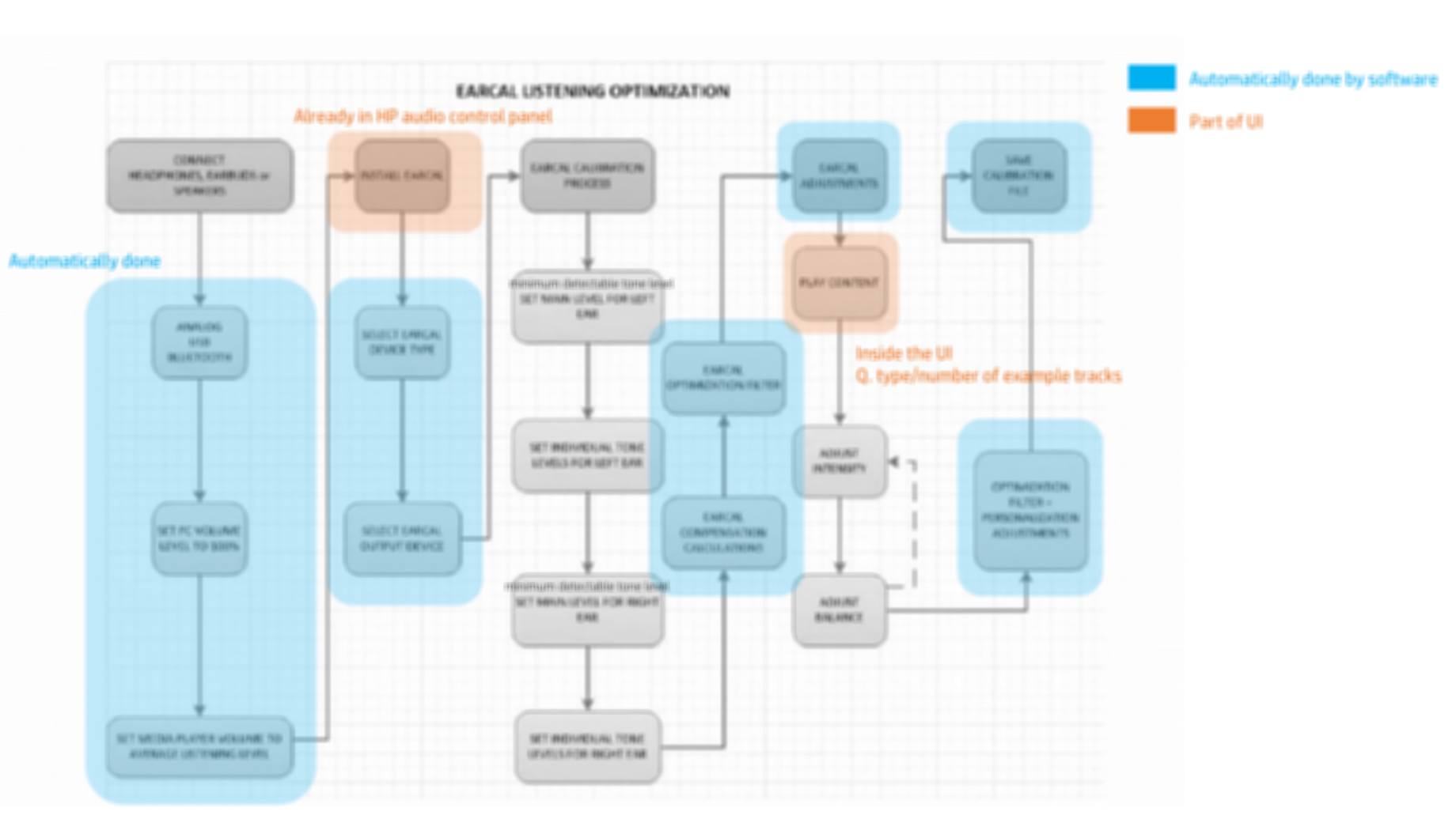
*Image is blurred on purpose.
I reviewed the technical workflow of existing technology developed by the third party vendor. I constantly communicated with engineers from the third-party vendor and internal team to understand the technical context. Then, I discussed the goal of the feature with product manager and marketing team. I reorganized the information that needs to be displayed on UI and those that should be hidden.
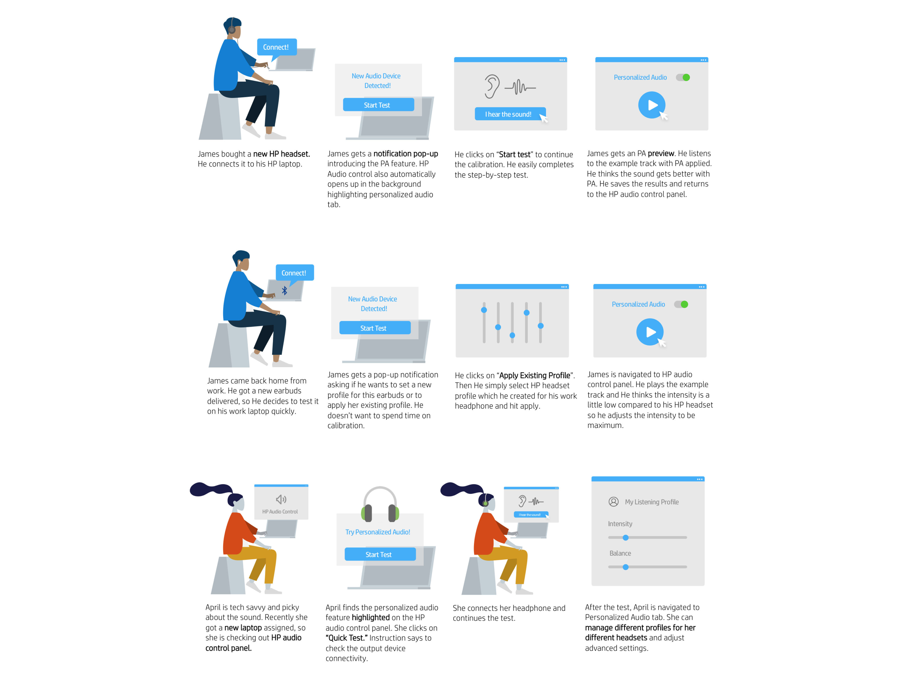
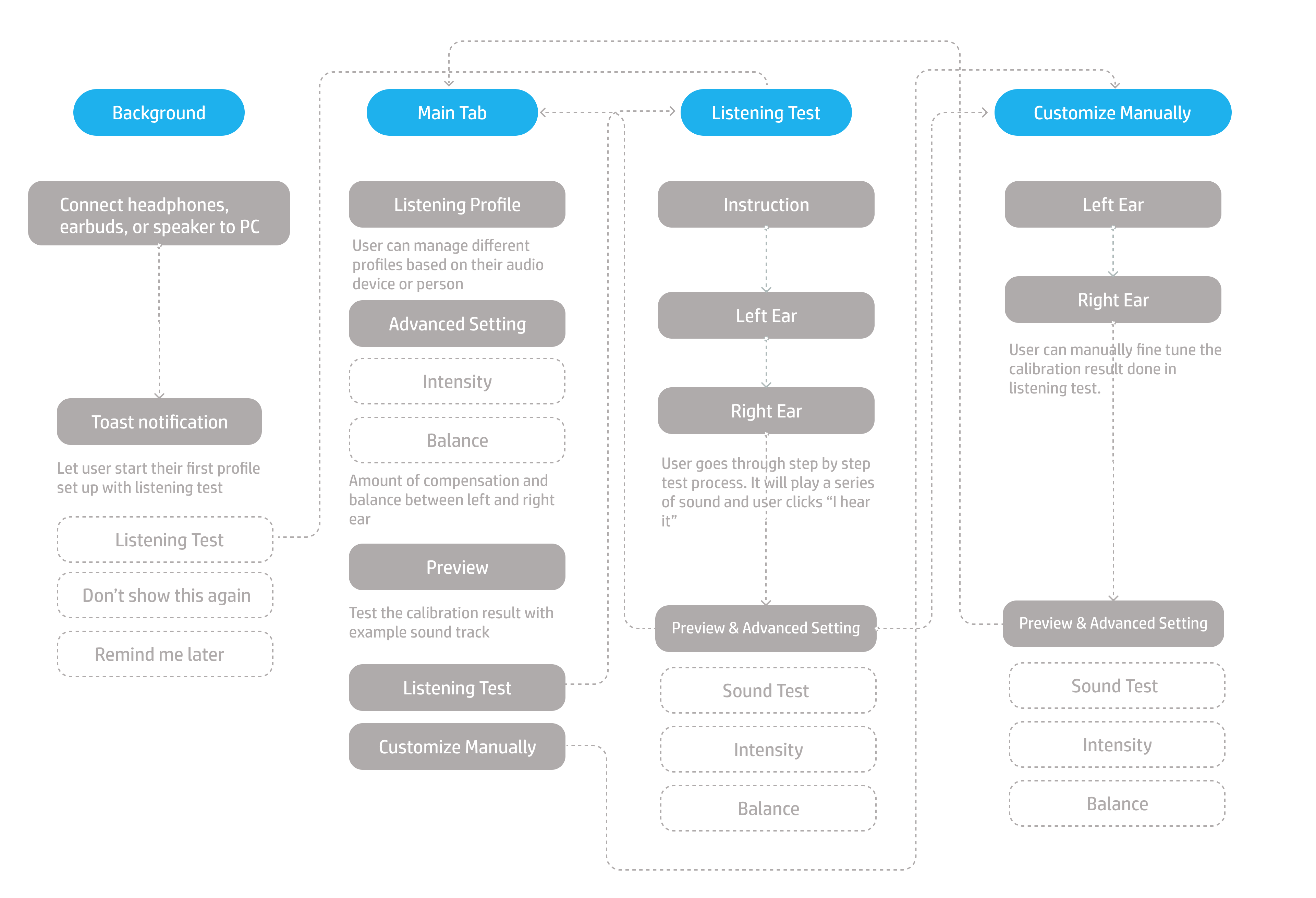
I recreated the experience workflow based on how user would react and behave on the new feature and UI. I iteratively designed this experience workflow after narrowing down potential user scenarios of how different types of users would interact with the app.
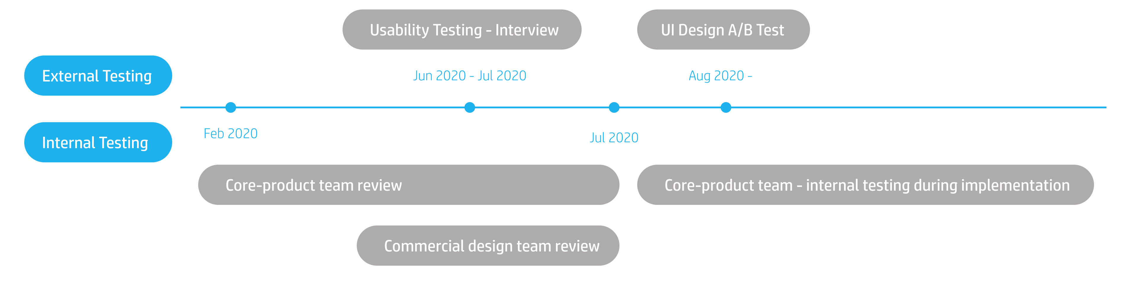
I repeated the iterative design process of prototyping and testing for about 8-10 times. We've conducted several core-product team review and design review with commercial design team.
The core product team consists of 1 Product Manager, 3 Technologists, 3 Audio RnD Engineers, and third-party vendor (1 Product Manager, 2 Engineers). In weekly review, we shared the project progress and discussed user experience issues.
For commercial design team meeting, I shared the UI updates and worked with Visual Designer to make sure that the UI aligns with the current design system. The feature I worked on is part of existing HP software so I followed the design guideline set up by other designers.
Also, I discussed the user study plan for validating the usability, readability, and accessibility of the app in commercial design team meeting.
In weekly core-product team review, we went through the user experience workflow several times.
We made design decisions on what to present on the UI and how to present the feature.
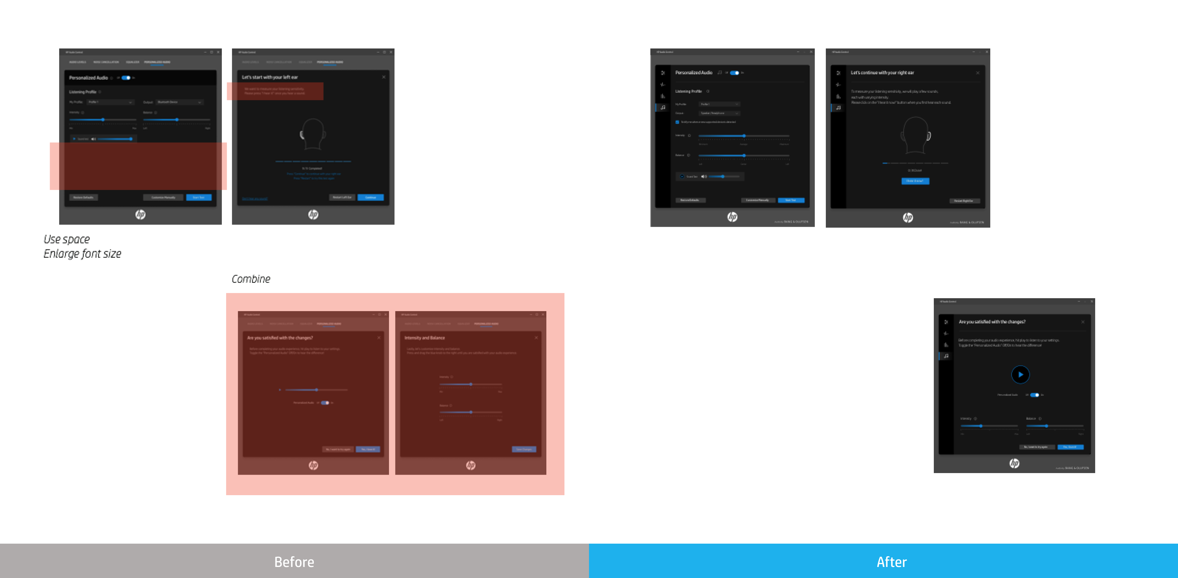
We simplified the steps of interaction and reduced the amount of information to be shown:
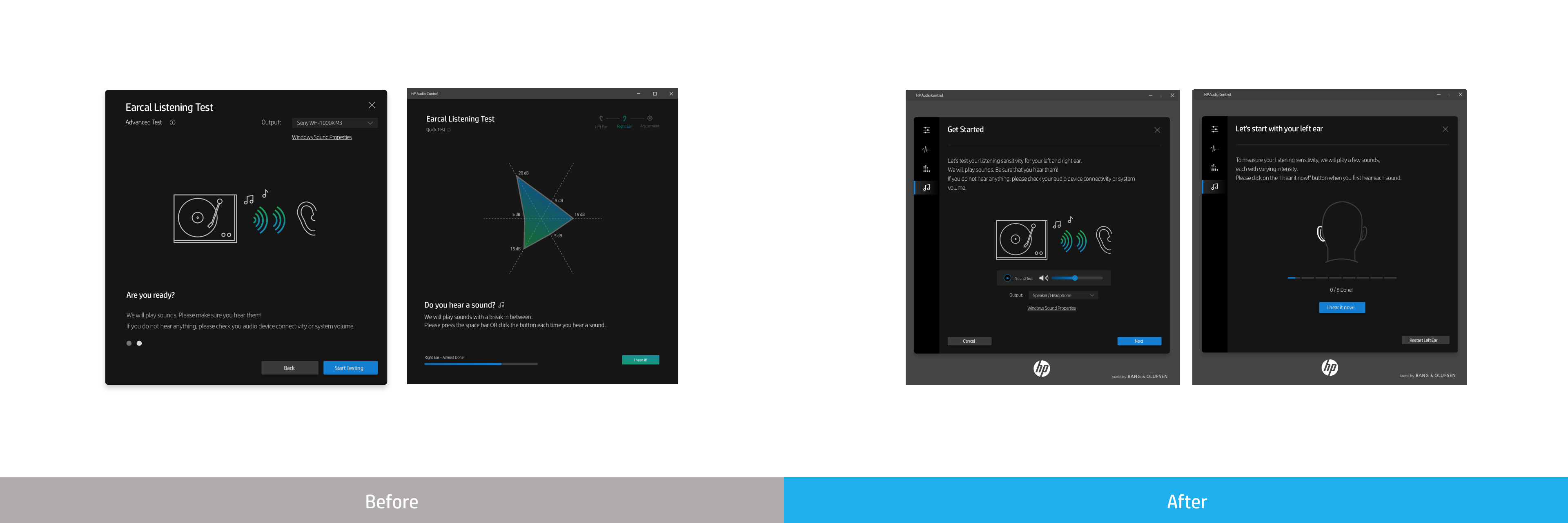
1) Removing ‘Master-level test’ from testing process in order to reduce complexity and enhance usability
2) Introducing ‘Customize Manually’ option for audio experts & returning users
3) Removing graph/chart that requires audio-related knowledge
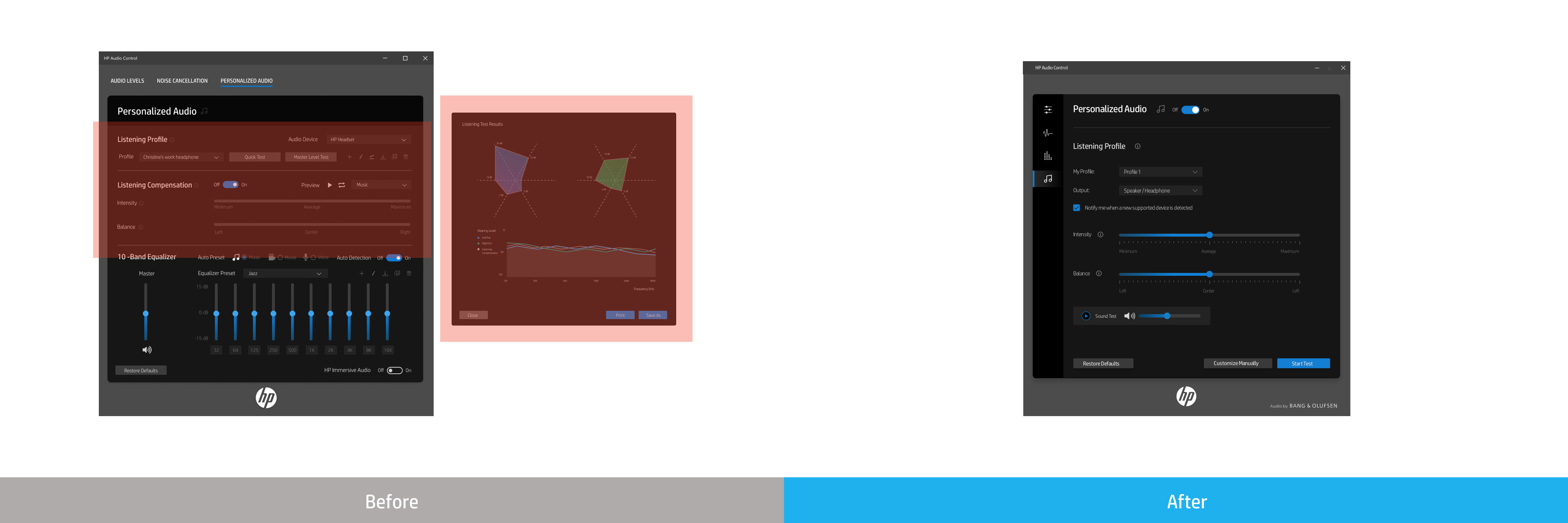
4) Separating Personalized Audio tab from other tabs independently
In weekly commercial design team review, I presented my design progress.
I got feedbacks from other UX designer, visual designer,and UX researcher.
Based on the feedbacks, I increased consistency of the UI design with other tabs in the app and redesigned some of UI elements to match with the current HP design system.
Also, I was able to increase usability of Earcal listening testing process by:
1) Introducing animation to provide users with visual feedbacks during the test
2) Planning user study and A/B test
3) Reducing the number of instruction pages from 2 to 1
I worked with 1 UX researcher from commercial design team to come up with two test plans for usability validation and created interactive prototype for the testing.
The purpose of the study was to do an early evaluation on the usability of the prototype, gather user feedback, and provide recommendations based on the findings. Usability testing was conducted using usertesting.com with the clickable prototype. We had 6 external participants that had audio device experience. These participants were asked to go through the prototype and think aloud. Overall findings concluded that users were able to navigate through the prototype, however they did mention that further improvements were needed to the prototype to avoid any confusion.
Based on user feedback and observations, we revisited the prototype design and made the design changes:
Enlarged text sizes and reduced unused area of the screens
Combined two screens into one in order to reduce number of steps
The purpose of the A/B Test was to evaluate the readability of two animation options for testing pages, gather user feedback, and provide recommendations based on the A/B test findings. UI animation on listening test screen was important visual feedback for users and we wanted to make sure that it conveys the right context to the users. A/B testing was conducted using usertesting.com with the EarCal prototype. We had 10 external participants and these participants were asked to go through the prototype and answer questions. The test result showed that users prefer one animation slightly more than the other, and we applied the result in our design.
During implementation, there were minor issues influencing the UI or UX workflow.
We had 35 languages to be translated and there were UI issues such as different paddings and margins for longer languages. I tested the UI element with longer languages such as Russian and German. Then, I provided UI guideline for relative spacing and fixed spacing. Relative spacing is where the UI element can be enlarged depending on the text size. Fixed spacing is where the UI element is limited to specific space/size.
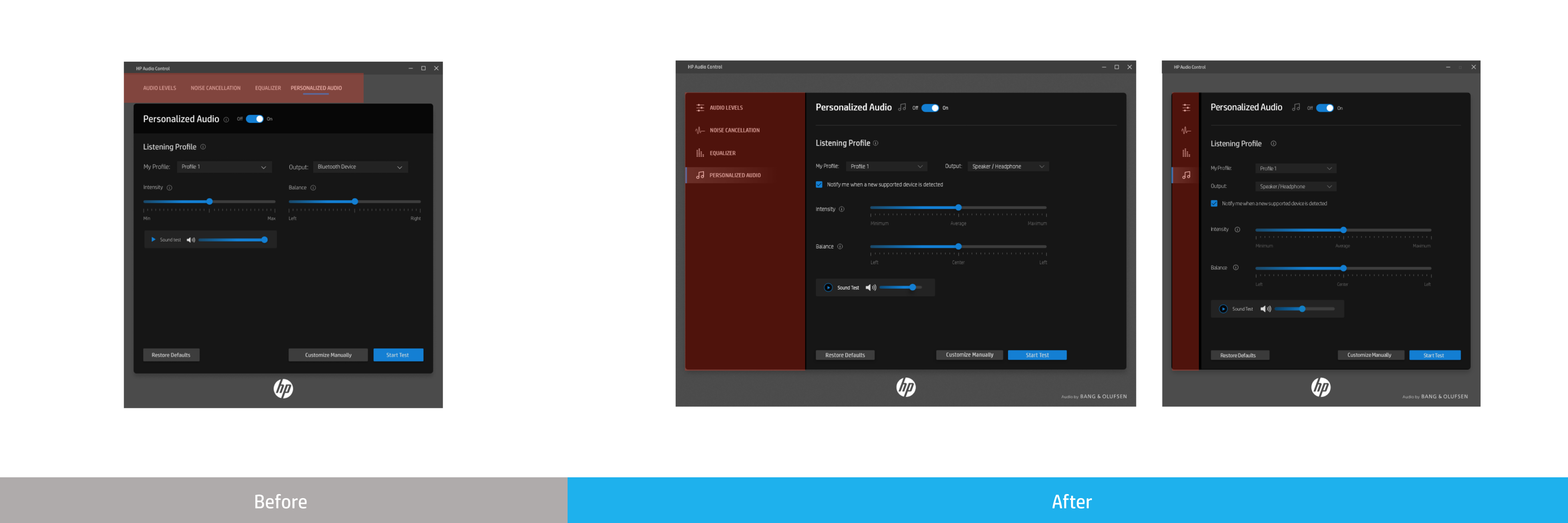
Visual Designer introduced the new navigation style to match the look and feel with other HP apps and I updated the UI with latest HP design system.
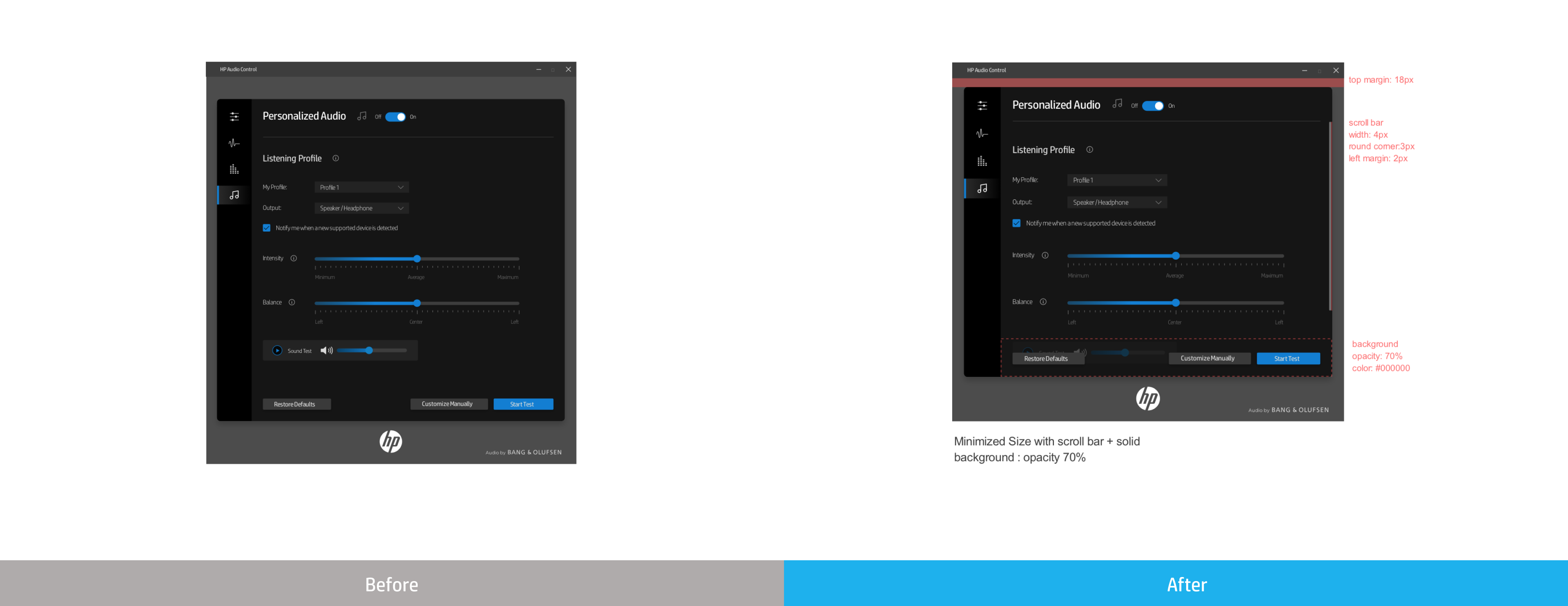
In previous build of the app, there was no limit on how small the app can be. We assigned the minimized size to prevent this issue. However, the app hid those information when it was minimized, and user had to scroll down to see those information. existing UI design had a lot of important information on the bottom. In order to resolve this issue, I suggested 3 different design options and the team has decided to use "half transparent background" option to provide visual clues to the user.
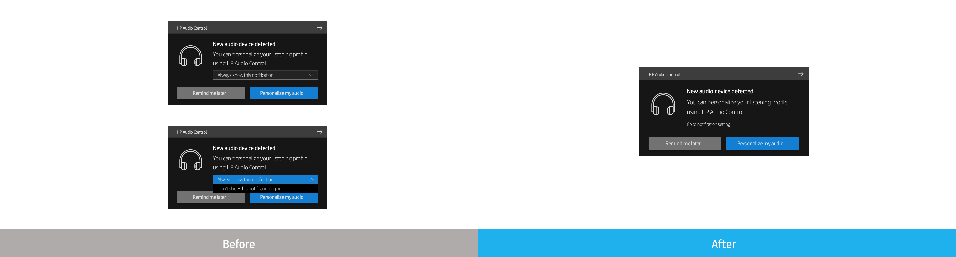
Due to the limitation of Windows toast notification design options, we iterated few times for better user experience.
Two third-party vendors I worked with on this project were using different UI framework. It caused extra effort to implement the consistent UI: different design hand-off style & different limitation on UI implementation. Also, sometimes miscommunication between three companies happened. From my side, I constantly documented my progress and design spec in order to minimize any communication issues.
Even if we updated the second version of UI after the user testing, we couldn’t put it into our first release due to the tight development schedule. In order to minimize any potential UX issue, I tried to come up with minimal but effective design changes for out of cycle update.
User study was helpful for answering the usability questions and making design decisions. Introduceing the user study earlier and more frequent in product timeline will enhance the overall user experience of the product.